Viewport
Once the user has selected variables using the control panel
and clicked the LOAD VARIABLES button in the toolbar, the app
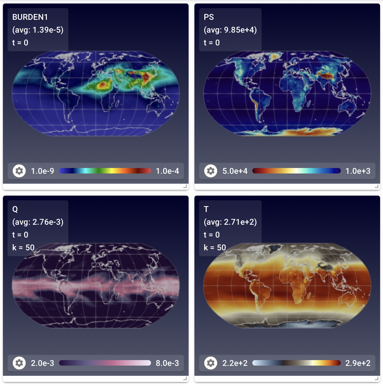
will show each variable in its own little frame (which we refer to as a "view") inside
the viewport. On the right is an example showing four views.
Within each view, the variable name is noted together with the indices of the vertical level (if applicable) and time slice being displayed, and the area-weighted global average on that vertical level. If the "area" variable is not present in the data file, then the arithmetic average is calculated and displayed.
Custimizing the viewport
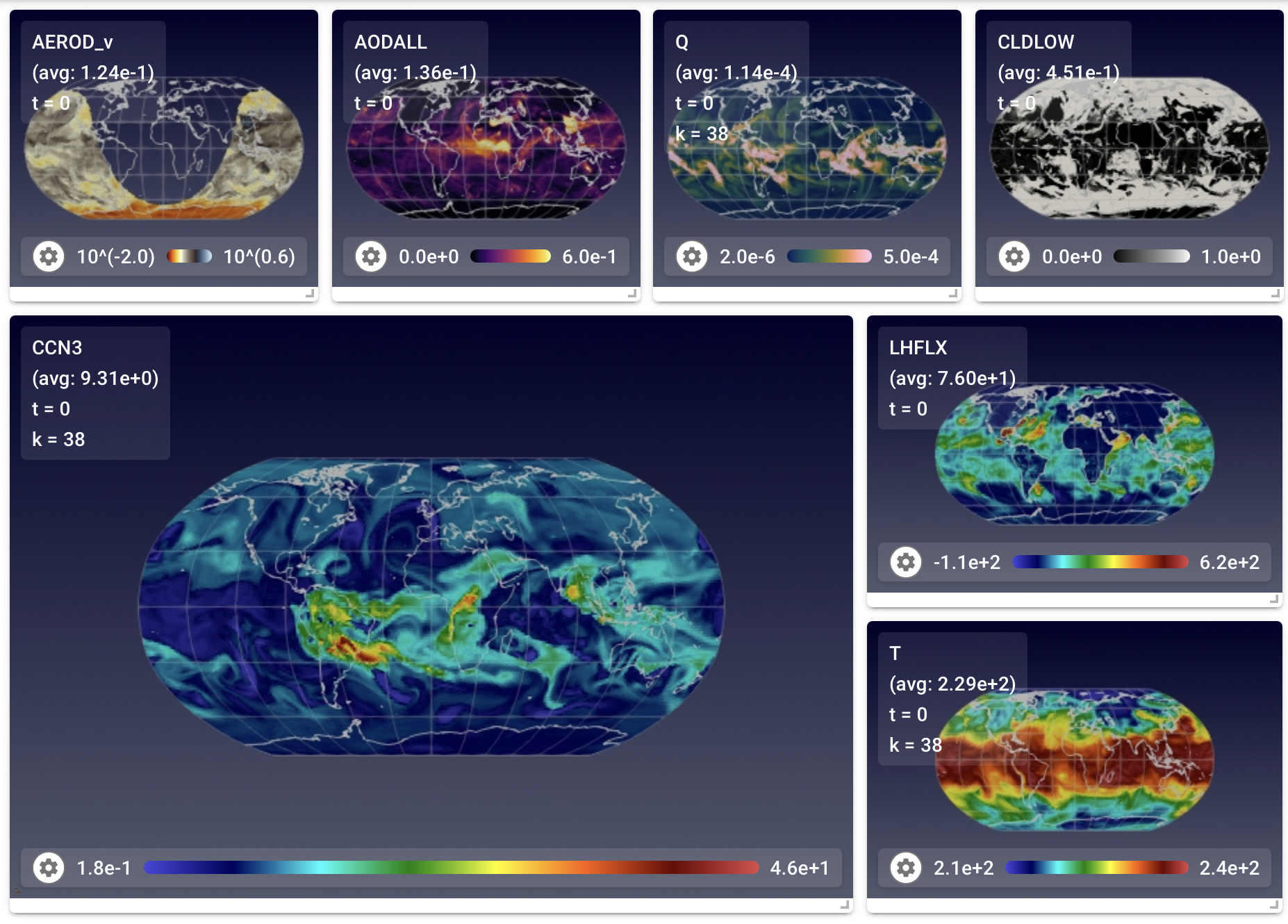
To help present multiple variables in an informative way, the app allows users to
- rearrange the views via drag-and-drop, and
- resize each view separately by clicking and dragging its bottom-right corner.
The screenshot on the right shows an example with rearranged views.
Furthermore, if a user saves a state file after these adjustments, they can later continue their analysis with the customized layout by using the app in the resume mode, as described in on the description of the toolbar.
Custimizing individual views
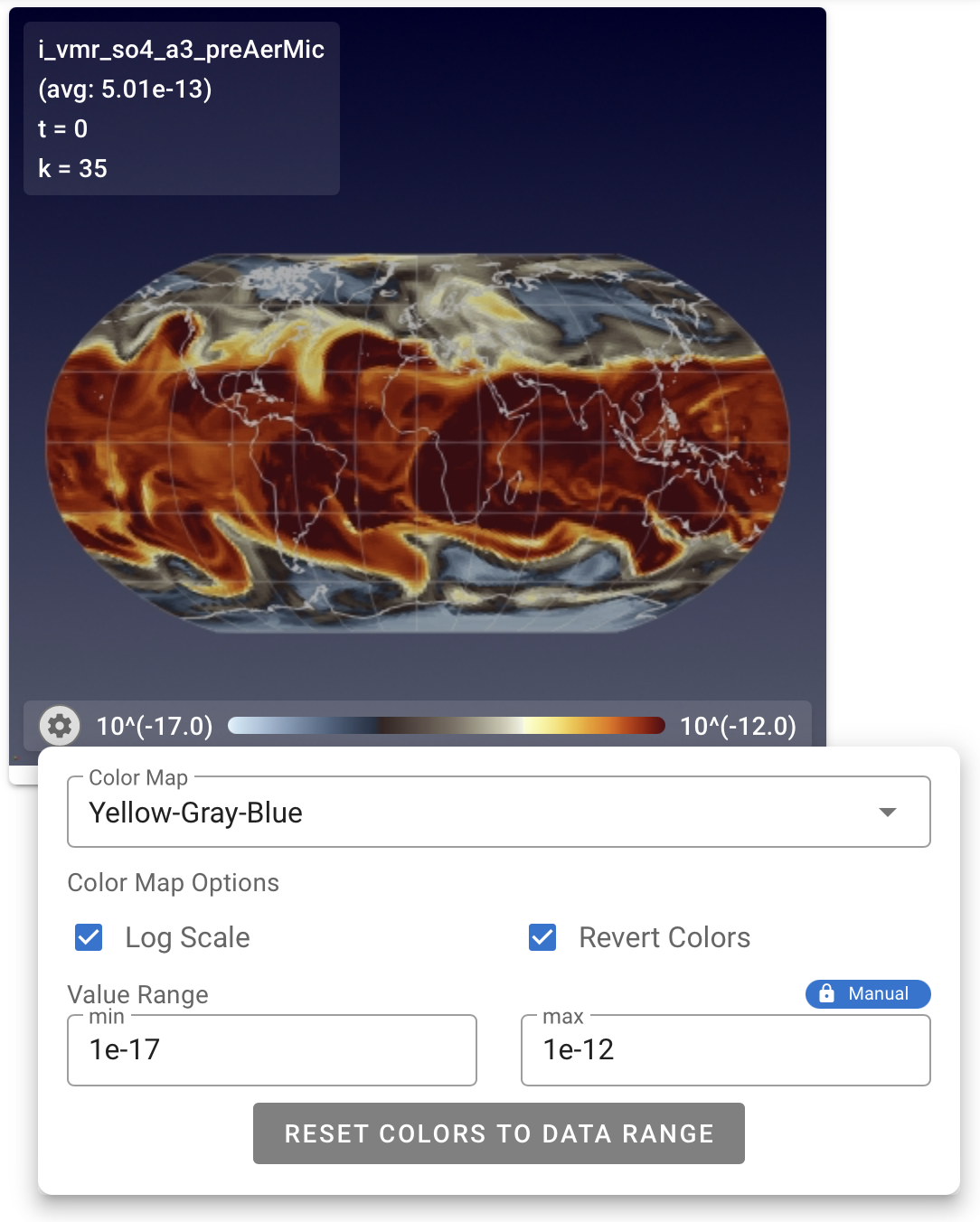
Each view can be further customized individually by clicking on the gear button in the bottom-left corner of the view. The click brings up a mini menu as shown in the examples below.
The mini menu contains options to control various properties of the view: a dropdown menu for colormap selection, checkboxes to turn on/off logarithmic scale and to invert/restore the color sequence, text boxes for changing the minimum and maximum values for color mapping, and a button to reset the color mapping to fit the value range of data slice.
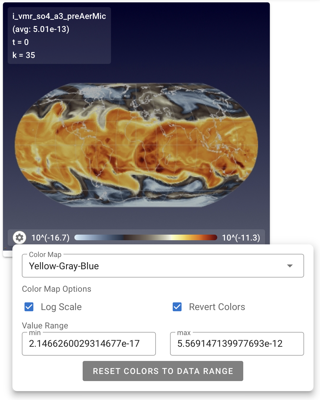
Tip: Automatic or Fixed Colormap Ranges
By default, the app will automatically span the colormap over the range of values of the current time slice and vertical level. The maximum and minimum values can be found in the mini menu, as seen in the left example shown above. When the "play" button in the control panel is used to cycle through different data slices, the colormap is automatically re-adjusted to fit the data range of each slice.
If the user specifies maximum and/or minimum values in the mini menu, a blue icon with a picture of a lock and the text "Manual" will appear above the maximum value, as can be seen on the right in the example shown above. In such a case, when the "play" button in the control panel is used to cycle through different data slices, the colormap will be fixed to the user-specified range.
Tip: Field Value Lookup in Colorbar
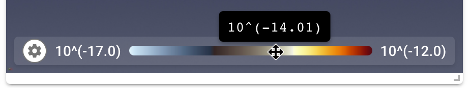
If the user hovers their cursor over a colorbar, the corresponding field value will be displayed, as shown by the example here.
Tip: Colormap Groups
The toolbar at the top of the GUI includes icons for two colormap
groups: colorblind-friendly and other. Only the colormaps belonging to the
selected group (or groups) are shown in the Color Map drop-down menu
brought up by the gear button.